this post was submitted on 16 Jun 2024
266 points (92.9% liked)
Data Is Beautiful
6909 readers
1 users here now
A place to share and discuss data visualizations. #dataviz
(under new moderation as of 2024-01, please let me know if there are any changes you want to see!)
founded 3 years ago
MODERATORS
you are viewing a single comment's thread
view the rest of the comments
view the rest of the comments

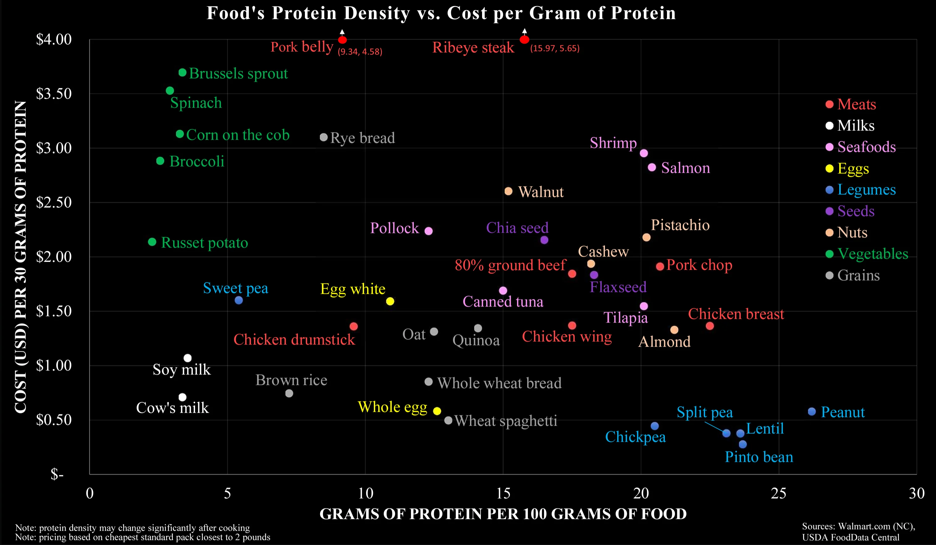
So much wrong about this chart. It is factually correct, but it answers the wrong question.
This chart makes it way too easy to optimise for cheap protein, which is misleading. It is not this what it takes to have a healthy organism. It takes a varied diet, with balanced quantities of liquids (see milk), vitamins (see sprouts), fatty acids (see salmon), minerals (see shrimps, eggs, walnuts), actually carbs (potatoes, rice, spaghetti), and much more...
I think it's specifically meant to debunk the idea that meat is the only affordable source of protein-dense food, when in reality there are vegan protein-dense foods that are even more affordable.
That doesn't conflict with the fact that a well balanced diet is important; it's just addressing one sticking point that tends to come up in these conversations.
The legumes are pretty much bs though (except peanuts) as those are dry weight, cooked weight drops Pinto beans to 9 grams of protein. Protein density drops because bean weight increases through absorption.
What's wrong with reducing density through absorption (of water)?
Nothing at all. But it reduces protein density, so makes 25 grams of protein per 100 grams weight meaningless. No one is eating uncooked, dried pinto beans.
And meat would go the other way. Less fat and liquid after cooking. Doesn't change the overall amount of protein but does change how much you can consume at once.
Exactly. That would hold true for the green vegetables (that are cooked) as well, broccoli will become more protein dense through water loss.
To me it seems that your interpretation completely disregards the Y-axis. On the other hand, I wouldn't think the colour coding does a good job in separating along the carnivorous-vegetarian-vegan scale.
It's not that they are separated on the chart, but that they are comparable (on both axes), that impressed me.
Most crucially, the graph is an oversimplification of protein content. Legumes do not contain the full amino acid chain unlike meat. Non-meats need to be evaluated with the nuance of its nutrients not necessarily being as bio-available for human digestion. Carrots and Vitamin A, for example.
Thank you for saying this. The PDCAAS shows the digestible properties of different protein sources. It would be a good multiplicative factor for the X-Axis to make the sources comparable, since Cow's Milk, Chicken, Egg, Whey, Casein, Tuna and Soy Protein (Isolate) have a score of 1 while Lentils, Tofu, Rice and Wheat have roughly 0,5.
That means you need to eat (and buy and cook) twice the amount of the latter to gain roughly the amount of actionable protein of the former.
I've had to debunk this myth multiple times in this post already, I'm not sure who started it. Legumes do have all the aminos and in sufficient amounts.
Also on bioavailability, it is a double edged sword. For example heme uptake is greater than mineral iron, but your body has very little control with inhibiting uptake when you already have adequate levels. With the mineral form your body has various ways to promote or inhibit uptake. The same is true of your example of vitamin A. You can pretty much eat as many carrots as you want and suffer no ill effects, eating too much liver or taking too many liver oil supplements however can lead to poisoning.
Lmao you don't need any animals or their secretions in your diet to be healthy.
Your seem to insist to twist this towards vegan wars, but this is you. It's not the graphics, it's not me.
There is no conflict here and no war. You made the false claim that for a balanced diet, animal parts are required. I corrected you, that's it.
Animal liquid somehow turns into gastrointestinal distress for me, and like 60% of the world. Maybe the diarrhea argument would help. Wield it carefully.
I guess you misunderstood my providing illustrative examples in parentheses. Replace or remove the examples, the argument is still valid.
In another subthread they've pointed out that processing food also changes its protein density, most obviously by water transfer.