266
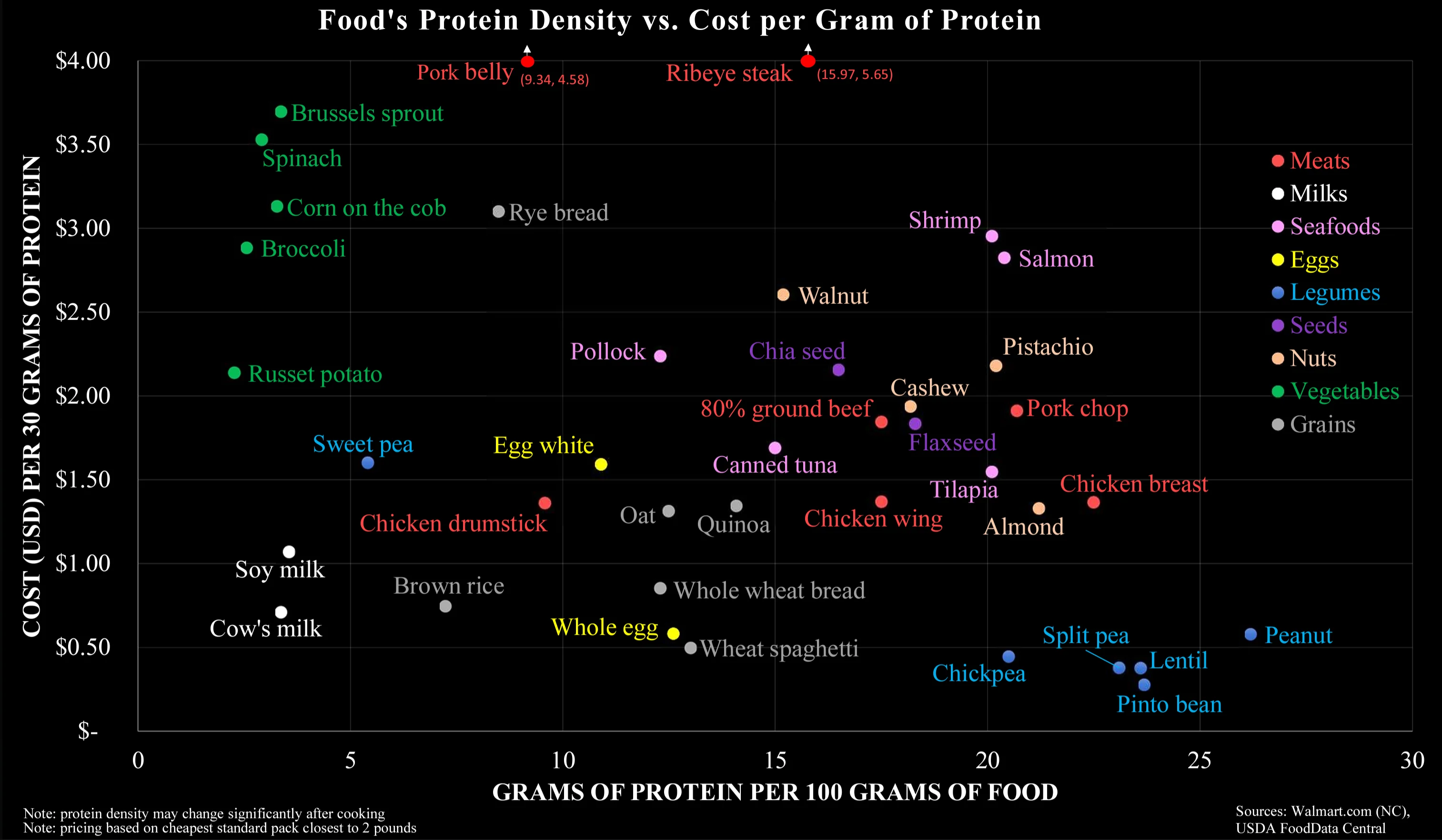
Cost by Protein Source
(lemmy.ca)
A place to share and discuss data visualizations. #dataviz
(under new moderation as of 2024-01, please let me know if there are any changes you want to see!)
So much wrong about this chart. It is factually correct, but it answers the wrong question.
This chart makes it way too easy to optimise for cheap protein, which is misleading. It is not this what it takes to have a healthy organism. It takes a varied diet, with balanced quantities of liquids (see milk), vitamins (see sprouts), fatty acids (see salmon), minerals (see shrimps, eggs, walnuts), actually carbs (potatoes, rice, spaghetti), and much more...
Most crucially, the graph is an oversimplification of protein content. Legumes do not contain the full amino acid chain unlike meat. Non-meats need to be evaluated with the nuance of its nutrients not necessarily being as bio-available for human digestion. Carrots and Vitamin A, for example.
Thank you for saying this. The PDCAAS shows the digestible properties of different protein sources. It would be a good multiplicative factor for the X-Axis to make the sources comparable, since Cow's Milk, Chicken, Egg, Whey, Casein, Tuna and Soy Protein (Isolate) have a score of 1 while Lentils, Tofu, Rice and Wheat have roughly 0,5.
That means you need to eat (and buy and cook) twice the amount of the latter to gain roughly the amount of actionable protein of the former.