Portugal, so we’d go with Moonspell!
InfiniteFlow
OTOH, if you build a playlist manager for playlists everyone can add to, you make sure nothing anyone adds will break it…
Sadly, this was a thing even before the web, let alone social media. There’s always been people for whom the vacations didn’t even “happen” unless they get to go on incessantly about them when they come back, ideally subjecting you to two hours of photos that mean very little to you. They derive little enjoyment from actually being there, they take it from showing it others…
For some people life is not worth living without external validation. Sad.
Jesus! Fucking! Christ!
As someone who fears bugs and is browsing Lemmy before going to sleep, my nightmares thank you, good sir!
1643 day streak here, and it still looks like it’s going to die on me any second now. I guess it was just an icon change (but… why?!)
At this stage, apart from my medication, I worry the most about my devices and chargers. Everything else, from toiletries to clothes I can buy if it turns out I forgot it and really need it. That lowered my stress with packing significantly (and I am not forgetting more things because of it).
Alan Dix’s book (aptly named “Human Computer Interaction”) is quite good, even if somewhat old by now. HCI is an actual academic discipline with, yes, tons of theoretical and empirical results that govern what a good UI should be. Many of which are indeed grounded in psychology, others in physiology, etc (what we call Human Factors). There is a whole special interest group of the ACM just about it: SIGCHI.
Do not confuse this with fashion/trends/taste. These change, resulting in widely different possible flavors of UI over the years. But the underlying principles are the same.
Another thing to remember is that the fact that Apple, Google, or someone else implemented an UI in a certain way doesn’t mean they are following best practices and guidelines. Novelty sells, even if at the end of the day it does a worse job of things…
Edit: added link to SIGCHI
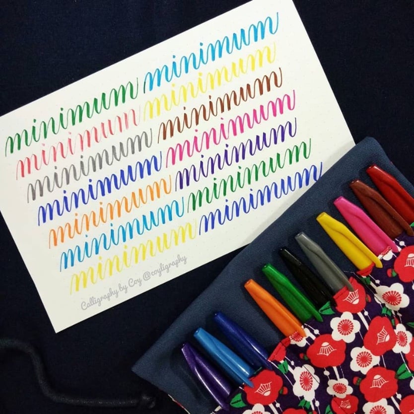
This is actually a thing. When learning calligraphy, it was one of the exercises we did. If you have good enough control of your hand and pen, then all strokes should be the same length, slanted the same way, and separated by the same spacing. When you manage this apparent “unreadable” thing, it means you nailed it!
The example below comes from this site (not mine)

I wish that would work. My Epson was always on and the ink kept drying. After it clogged the print head once too many times and I could not fix that in less than 10min, I just gave up on the piece of crap. I now go to a print shop to print what I need which, admittedly, nowadays is just a couple of times a year.
Nice try, Guybrush!

Was going to post this as well. Just replayed it again, never gets old!