Programmer Humor
Post funny things about programming here! (Or just rant about your favourite programming language.)
Rules:
- Posts must be relevant to programming, programmers, or computer science.
- No NSFW content.
- Jokes must be in good taste. No hate speech, bigotry, etc.
Should include a concept to reduce impervious surfaces in modern times. User experience is not the only variable.
Pretty sure the user experience folk are screaming for a path to be built there but are getting ignored.
They aren't being ignored. The corner needs to be a right angle for compliance reasons.
But the actual corner isn't even a right angled corner.
They were forced to cut corners in implementation.
Everyone says, they are not bringing their best angles. Triangles. Quadrangles. And some I assume are acute angles.
What we should do is put chainlink fence around the corner, but make the part that the users loved the most accessible with a monthly pass that they can only walk on with shoes purchased at the university store.
- spez
You mod 16 subs, what do you get?
Another day blocking API requests.
Saint Peter don’t DM me cuz I can’t go.
I owe my soul to Spez’s asshole.
It's important we do it that way for our 🌟brand identity🌟.
Management wants us to add more AI and Machine Learning so the user ends up in the parking lot.
How about a pond?
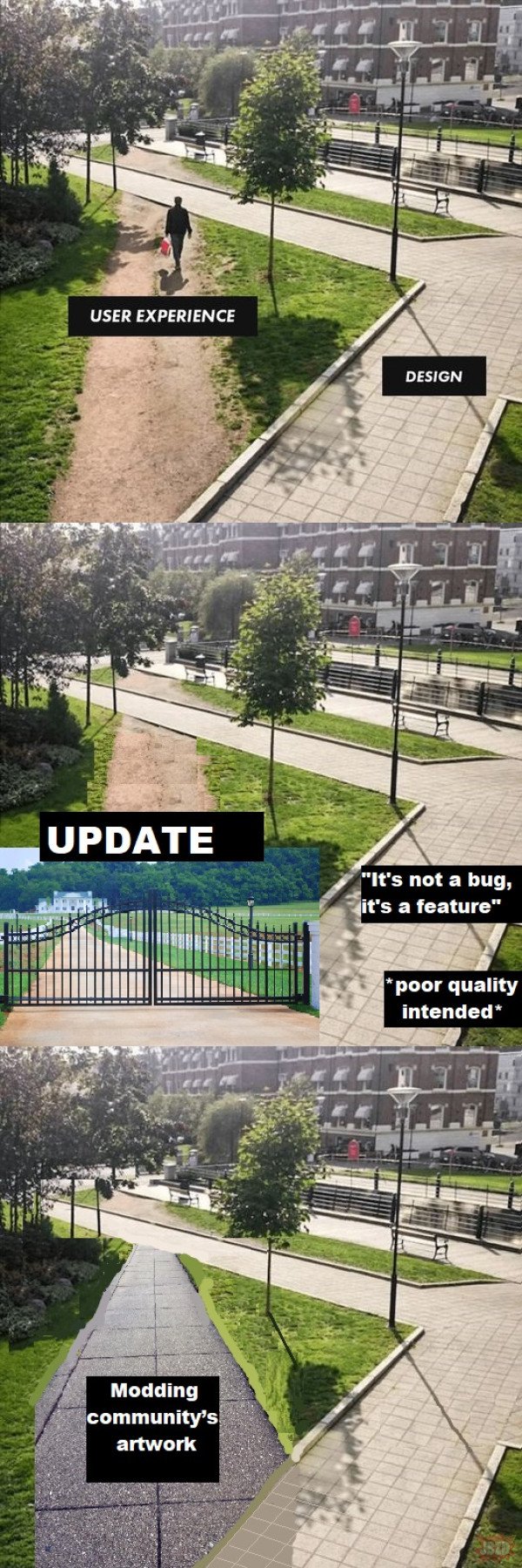
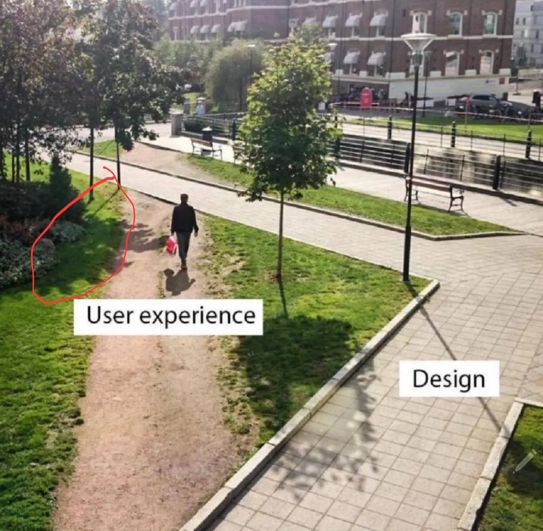
A lot of universities with large campus grounds take the approach of observing the natural foot traffic wear patterns on grassy areas, and then build walkways where the most worn down parts are.
Its... pretty obvious.
If everyone is taking an alternate, non designed path... your design sucks, modify it to facilitate what people find more effective.
These are apparently called “Desire Paths”
And there's a whole community for them! Not sure how to link to it though.
iirc it's what they did in central park. Don't create paths and later pave the desire paths that show up
They did this in a park by my house. It used to have a long paved path that meandered through some woods. Engineers with the city noticed the shortcut that people were cutting through, and realized that most people didn't care for the long path. Apparently some anonymous person or several had been dumping gravel along the shortcut for traction and to make it less muddy. So the city paved the shortcut, and removed the long path so that nature would reclaim it.
Democracy in action.
It was kind of sad though to lose the long path because I liked walking through there, especially during the fall, but if it means having less maintenance machines going in there every week to pollute the place (lawnmowers, asphalt patching, etc) then so be it.
Designers need to wake up and realize their job is to understand what the user wants not what they saw in a wet dream.
Not a universal rule, however. Theres the whole concept of "optimizing yourself out of the fun" and what not in video games. Or the hardships being part of what makes a game fulfilling. It depends on what your goal is
Wake up Nee-Oh!
Whenever that happens, the design is wrong.
Fixed. Added a wall with razor wire on top to prevent this.
Ah yes, the hostile architecture approach.
In IT, sometimes there's security reasons for the designed detour.
But then good design would completely obstruct the shortcut from the user's view.
change log: We've adjusted the 20 year old UI to better reflect modern aesthetic trends that our new hires learned in school.
I, unfortunately, have to use GitHub at $DAYJOB and this is me. I navigate most of the webpage via the URL bar now.
Basically, let's say I'm working on a repo github.com/tomato/sauce/ and want to navigate to the Releases page.
Via the webpage:
- Type
github.cominto the URL bar. - Don't find
tomato/sauce/in the list of recent repos, even though it's the only repo I work on. - Click on some other repo that's at least in the
tomato/org. - Navigate up to the
tomato/org. - Find the
sauce/repo in the list. - Traverse half the fucking screen to hit the "Releases" heading in the middle of the About-section.
Via the Firefox URL bar:
- Type
gi→t→s→r→. - Hit Enter.
I admit, it's hard to compete with the latter, but I wouldn't know how to navigate that way, if the former wasn't so terrible.
What kind of sicko try to find their repos from the recent list on the main page??
Hopefully somebody else $DAYJOBs at GitHub and will see this.
"What the user needed" / "What management demanded"
What the shit happened to that tree's shadow?
Probably the tree is shadowing the same area that a window in or near the building the picture is being taken from is illuminating.
Also, why is this shadow off from the others

that's just perspective, they're only parallel when looking for a perfectly top-down angle

That’s right, it goes in the square hole.
