this post was submitted on 10 Nov 2024
662 points (98.5% liked)
Programmer Humor
32461 readers
641 users here now
Post funny things about programming here! (Or just rant about your favourite programming language.)
Rules:
- Posts must be relevant to programming, programmers, or computer science.
- No NSFW content.
- Jokes must be in good taste. No hate speech, bigotry, etc.
founded 5 years ago
MODERATORS
you are viewing a single comment's thread
view the rest of the comments
view the rest of the comments

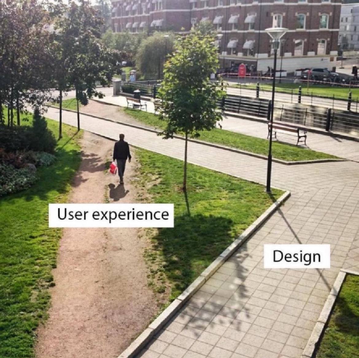
Whenever that happens, the design is wrong.
Fixed. Added a wall with razor wire on top to prevent this.
Ah yes, the hostile architecture approach.
In IT, sometimes there's security reasons for the designed detour.
But then good design would completely obstruct the shortcut from the user's view.
change log: We've adjusted the 20 year old UI to better reflect modern aesthetic trends that our new hires learned in school.
Works as intended. kthxbye
I think it's from the time where things were done manually and round lines were a pain to draw. There wasn't AutoCAD and undo features in a neat software 🤣