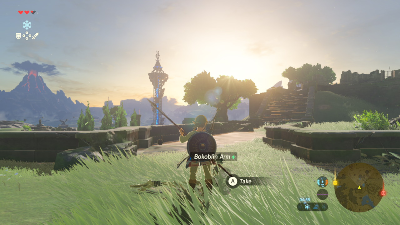
I can't remember which game it was (something on the Switch, so maybe a Nintendo game) where the game itself told you which button to press by showing four circles on screen (e.g. next to the speech bubble) and only one of these circles is filled out, so instead of a letter, you know you have to press the right button or whatever... I really like this design choice because it's so intuitive
Lemmy Be Wholesome
Welcome to Lemmy Be Wholesome. This is the polar opposite of LemmeShitpost. Here you can post wholesome memes, palate cleanser and good vibes.
The home to heal your soul. No bleak-posting!
Rules:
1. Be Respectful
Refrain from using harmful language pertaining to a protected characteristic: e.g. race, gender, sexuality, disability or religion.
Refrain from being argumentative when responding or commenting to posts/replies. Personal attacks are not welcome here.
...
2. No Illegal Content
Content that violates the law. Any post/comment found to be in breach of common law will be removed and given to the authorities if required.
That means: -No promoting violence/threats against any individuals
-No CSA content or Revenge Porn
-No sharing private/personal information (Doxxing)
...
3. No Spam
Posting the same post, no matter the intent is against the rules.
-If you have posted content, please refrain from re-posting said content within this community.
-Do not spam posts with intent to harass, annoy, bully, advertise, scam or harm this community.
-No posting Scams/Advertisements/Phishing Links/IP Grabbers
-No Bots, Bots will be banned from the community.
...
4. No Porn/Explicit
Content
-Do not post explicit content. Lemmy.World is not the instance for NSFW content.
-Do not post Gore or Shock Content.
...
5. No Enciting Harassment,
Brigading, Doxxing or Witch Hunts
-Do not Brigade other Communities
-No calls to action against other communities/users within Lemmy or outside of Lemmy.
-No Witch Hunts against users/communities.
-No content that harasses members within or outside of the community.
...
6. No NSFW Content
-Content shouldn't be NSFW
-Refrain from posting triggering content, if the content might be triggering try putting it behind NSFW tags.
7. Content should be Wholesome, we accept cute cats, kittens, puppies, dogs and anything, everything that restores your faith in humanity!
Content that isn't wholesome will be removed.
...
8. Reposting of Reddit content is permitted, try to credit the OC.
-Please consider crediting the OC when reposting content. A name of the user or a link to the original post is sufficient.
...
Also check out:
Partnered Communities:
6.Jokes
...
Reach out to LillianVS for inclusion on the sidebar.
All communities included on the sidebar are to be made in compliance with the instance rules.
Legend of Zelda?

Oh god, I want to experience this game for the first time again.
I got back into video games again during lockdowns and after leaving a very soul-crushing relationship. It was probably the perfect time in my life to experience BotW.
Playing games on pc and getting xbox button hints while using a Playstation or Nintendo controller is a special kind of frustrating. Like anything else, you get used to it, but I think I would like the position based hints you describe a lot better.
I think it’s all the Switch games, or most of them. It’s part of the system font. It’s at least any game that can be played with a single joy-con because the traditional layout doesn’t match the labels in that configuration.
Nintendo is generally good at this part of design. Back in the GameCube days, all the buttons were different shapes, sizes and were easy to tell apart by feel, so they just used icons of the buttons. In the N64 days, X, Y and Z were all triggers in different positions, and the C buttons had arrows on them so you could tell by the icon which was which.
Most Nintendo Switch games do this. I think part of why is you might be using a pair of Joy-cons or a Nintendo brand controller with the Nintendo ABXY layout, 3rd party controller with the Xbox ABXY layout, a sideways joycon with ABXY buttons but rotated 90 degrees including the labels, or a sideways joycon with unlabeled buttons.
There’s no way for the game to consistently the way your controller is labeled, but it can know which of the 4 buttons needs to be pressed based on location.
when I was learning to play poker we had the various hand rankings printed up on each wall so you could just look up to see the order.
This led to an amusing meta where you would see your opponent look at their hand, squint up at the wall and then raise and you knew you were hosed. This then led to bluff glancing at the walls before betting.
This then led to bluff glancing at the walls before betting.
God, I love it when things like this start to develop when playing games with friends. Especially when it's a newer player, or maybe even the quiet person that starts doing it - the first time you catch on to someone pulling a trick like this is the best possible feeling of, "you son of a bitch!"
Leans over to neighbor, “hey I don’t think Tommy is very bright, he keeps looking up at the cheat sheet for a pair every time”
As someone who mostly uses an xbox controller and occasionally uses a switch, I could use this too.
First thing I did on my steam deck was to change it to Nintendo layout haha
anytime I switch systems it takes too long to remember the 4 right thumb buttons
My girlfriend has gotten mad about this in the past. I'm like hold the run button then press the jump button. She would get angry and tell me to say which buttons those are. I would really have to think about it, when playing a game I associate a button with the function and forget which button is what.
As someone who switches between Xbox and switch pro controllers, the struggle is real. And I've been playing video games my whole life.
I used to call it the Zelda machine, but now that factorio is on Switch, I guess that isnt quite true any more.
I go between PS4 and a switch pro control often, and it's not that they all use the letters / symbols for different buttons, it's that Xbox and Sony agree what button position is used for what as default, enter, back, etc.
Nintendo breaks that symmetry, and put the enter button on A, so when I go to watch a movie on playstation I'm constantly exiting the menu because that position is O, the back button for Playstation.
Yeah I really don't understand why the hell they have to make it so different. Why do they need to distinguish themselves in this way? All it does is fuck up our gaming experience.
Is it just me or has someone gone through and down voted every single comment in here?
Edit: actually every Lemmy world post is showing all comments as having 0 points. Interesting.
Why does Nintendo use a backwards button layout?
A better question would be why Microsoft went with a nonstandard layout when they designed the Xbox controller. Nintendo had been using the A-to-the-right layout since 1990.
I believe because because they consider the outside buttons to be more natural to press first, then you work your way in.
Even starting with the NES controller, button A was primary and on the outside.
Division between console camps. "No, mine is the right layout!" Frustration when switching, creating a soft lock in effect.
I was thinking, "I need this for the first 2 hours every time I switch to/from a Nintendo game."
Holy fuck I'm not the only one. My partner and I watched The Last of Us and I wanted to play the game. He had it on his ps4, which I have never played. I made myself the same thing with the dumb ass square, circle, triangle, dodecahedron layout on the PS controller. He laughed at me too :C
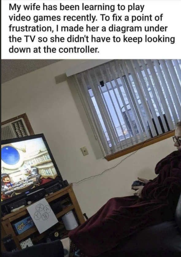
You must be trolling her the buttons are swapped!
No they're not. The Nintendo button layout has A/B and X/Y swapped from the Xbox one, and she's clearly playing Super Mario Oddysey
Fun fact: XBOX, Playstation and Switch all have an "X" button. And it's in a different position for each of them.
I don't even remember the last time I played Xbox, and I definitely spend majority of my time on Nintendo, but I still see Y as on top and A on bottom lol
I'll never get over Nintendo's decision to not have the button letters alphabetical like Xbox controllers do (or even just use shapes like Sony). Whenever I play on my Switch, the Y X buttons almost always throws me off, heh. I know Nintendo is Japanese and they tend to write from right to left, so I'm guessing that's how it ended up like that initially.
Edit:
Since a lot of folks are asking how they're alphabetical, I simply mean A comes before B and X before Y. I'm not saying they're alphabetical entirely (since if you read all of them clockwise/counterclockwise then it obviously doesn't make sense), just on their own individual "lines," e.g. X and Y are on their own "line," as well as A and B. It's not entirely logical when you think about it, but that's just how I and a number of others think about it. It's a subjective thing, I suppose.
to be fair, nintendo set that standard before both microsoft and sony were even in the console gaming space.
Tbf hasn’t the ABXY layout of nintendo consoles been consistent since the snes days, predating xbox? Unless your argument is that you wish they flipped it for american consoles a long time ago or something.
Also that interpretation behind the ab/xy difference kinda blows my mind lol
Nintendo set the standard in 1990 with the SNES. Microsoft broke it in 2001 with the Xbox.
First off, genius and I don't know why I never thought of this! So smart. So obvious.
Second, what game is she playing?
This is adorable.
When I'm playing a complex game on the PC such as KSP or even something like Eve online I have tons of documents posted up to help me with navigating it.
I think I find myself wanting a little bit of a tactile dot or something on the button, so as to more easily intuit which one to press. You could even retain the switch's ability to flip around the controllers, if you just put all the tactile dots on the outer radius of all the buttons. Like, put a little bump on the top of the top button, put a little bump on the bottom of the bottom button, etc. The only thing I can't really figure out is how you might refer to that in a game, or refer to that visually in a way that makes sense, other than maybe just building that association over time. But yeah, having them be distinguishable tactily is, I think, a good idea.
