1156
Frontend vs backend
(lemmy.ml)
A highly compatible design with no ads, unnecessary images, videos, animations, scripts that goes straight to point delivering you exactly the information you need and nothing else? Something that's easily accessible even with old feature phones allowing older people to get information easily?
Simply something that loads instantly and just works?
Who would want that?
Found the backend dev. "CUT THIS AESTHETICS NONSENSE! GIMME THE VARIABLE CONTENTS ALREADY! WE'RE 3.54 NANOSECONDS BEHIND!"
Frontend: "Come on, this needs at least some flair. This isn't the 90s."
Throws React at it
React ugh, everybody is using NextJs these da- ....oh, what's that? We've moved on already?
No one who is going to pay you wants that. All they care about is user engagement.
what is wrong with this frontend? not enough ads? loads too quickly?
I would hire you as my lawyer.
No cookie banner with the worst dark patterns of UX imaginable
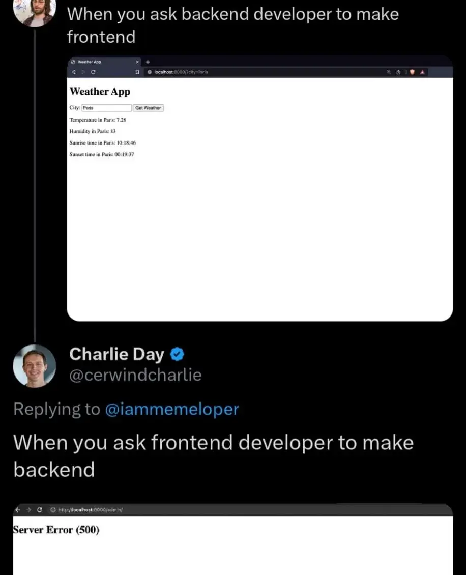
The page at the top looks perfectly fine. It's useful, it gets the job done and it's lightweight.
almost as good as the motherfucking website. :D
I like the better motherfucking website
That person must have his monitor in vertical orientation
Shorter lines are easier to read because it's easier to find the beginning of the next one. Rule of thumb is indeed a maximum of about 80 characters, go take a random printed book and see how long the lines are they're like that for a reason. (Newspapers are shorter because smaller print, also, more opportunities for headlinest).
The contrast and line spacing stuff -- debatable. But adjusting line-width is pretty much a must. Not doing anything somewhat worked on 4:3 monitors but it's definitely awkward on 16:9 and on 21:9 your head is definitely on a swivel.
Oh and those large margins are very useful for things like footnotes, btw, or meta-information about the text (like those textbook "this is an exercise" stylings, just move the marking over to the margin). There's also plenty of place for a hierarchical list of contents, always on screen, and various other nav stuff. None of that will degrade loading or runtime performance to any noticable degree.
Also of course note that that's for text-heavy content, stuff you read as in reading an article or book, not stuff you look at in the sense of "reading" a poster. In this case you can e.g. turn those bullet-points into rectangular areas (also come up with a sixth one, then) and display them in a grid, each containing, well, what they contain now but also a link to further information. You see that pattern all over the place on the modern web and it's a good one. Would need quite a bit more content than is present on those websites, though, otherwise you have more navigation shenanigans than content. You don't need a fucking library index for a post-it note.
Source: My HTML is rusty as fuck but I know TeX.
Hate it, fuck that low contrast bullshit that makes me think my glasses are dirtier than they actually are.
You sound like a backend developer.
maybe 🤣
It's almost fine. It needs to include units for the measurements.
The top one's a motherfucking website, indeed.
motherfucking website
One of my all time faves!
God I wish weather pages were more like that first one.
I like to use this one: https://wttr.in/
You can get info for a specific city by appending it like this: https://wttr.in/newyork
As a backend developer who occasionally has to work on the frontend, that top image is pretty accurate although it requires bootstrap smeared all over to pretty things up a bit. After that it will have the "Good Enough" seal of approval.
I can make HTML look alright if I have to and it's simple enough requirements.
The real hell is making it look good in an email. Oh, you used something from the last 20 years of HTML/CSS progress? Well fuck you.
Good, that we have specialists for both and nobody is advocating that everyone should be doing full-stack work... oh wait.
As a full stack developer I can assure you I can easily produce the result displayed in both those panels in the image 😏
Full-stack development and devops: When you need an entire IT department but only want to pay for one person.
Looks like a perfectly fine frontend to me.
Asa backend dev, it should be a 503 error. I live in 503 land.
A proper backend developer would have the query be a URL using the GET method with a parameter that the user can fill-in directly in the address bar and the result be a text/plain page with just a bunch of numbers separated by pipe characters (or an application/json page with that info encoded as JSON if you wanna be fancy).
This has the added advantage of working both for humans and as an API for use in machine to machine communications via HTTP.
The frontend developer made the backend so inefficient that it runs out of memory
They have this cool hack where they emulate Edge within Node.js and then run their stuff as a webpage within Edge.
I do front and backend work. Biggest issue I see is people not thinking through interfaces properly (e.g. efficiencies & atomicity of operations), sanitizing inputs on both sides, error handling, and putting in the appropriate validation, authorization & testing.
As a full stack dev I'd like to say that the issue I see most from backend devs isn't a lack of styling, it's their need to wrap every element in 15 motherfucking divs. They don't seem to understand that most html elements are self contained and can stand on their own.
After some time toying with CSS I have decided to fuck it and whenever I need to make a website I will just either:
Post funny things about programming here! (Or just rant about your favourite programming language.)