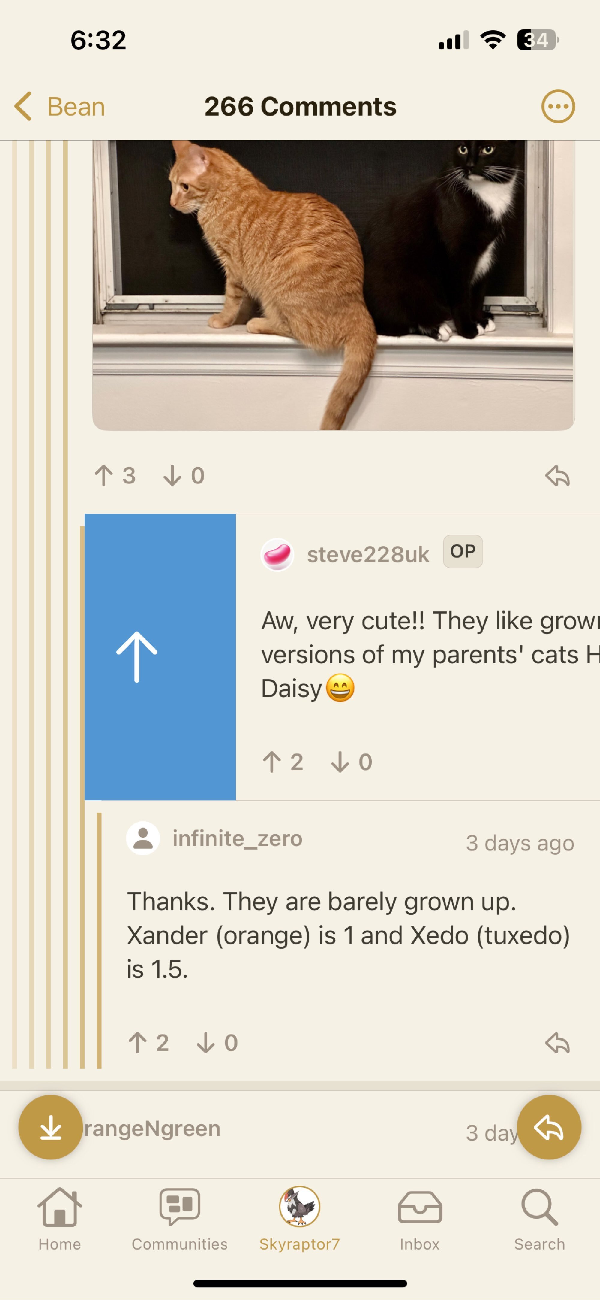
Some more feedback:
- search for comments would be nice
- I think the splash screen should only be a skeleton of the tab bar/nav bar. The icon might not fit the user chosen app icon, also it makes the app feel slower. Apple’s HIG also recommends the skeleton
- images in the feed should have the full height (otherwise most memes and posts aren’t readable without a tab and dismiss)
