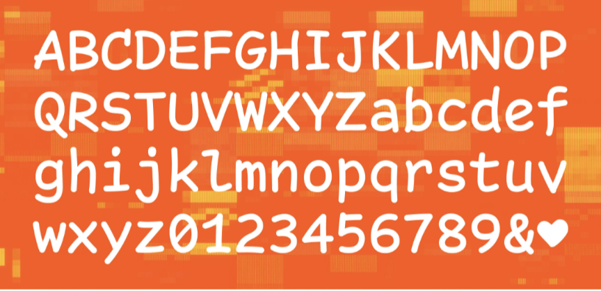
I've unironically been using this font ever since I found it a year or two ago. I find it makes it so much easier to read everything. I've even suggested it to others. It's actually a decent font.
Programming
Welcome to the main community in programming.dev! Feel free to post anything relating to programming here!
Cross posting is strongly encouraged in the instance. If you feel your post or another person's post makes sense in another community cross post into it.
Hope you enjoy the instance!
Rules
Rules
- Follow the programming.dev instance rules
- Keep content related to programming in some way
- If you're posting long videos try to add in some form of tldr for those who don't want to watch videos
Wormhole
Follow the wormhole through a path of communities !webdev@programming.dev
I actually used it for a while and still have it as a terminal font on a computer. It's not as best as you'd think. The characters have distinctiveness and it's a very funky font. It was a pretty great change for a while actually.
I recently installed the linked font as my font in XCode and so far I’m loving it:
Nope wouldn’t use it. The 1 vs lower case L are way too similar
The pairs version linked (which Is my daily driver), I don't think it's bad at all

Thanks, I hate it! :-P
The font in the pictures seems fine but the font in the text is horrible. What is with those "y"s
The post links a similar free version (by someone else) that doesn’t have those Ys and Vs:
