this post was submitted on 15 Nov 2024
297 points (94.1% liked)
Linux
50327 readers
1187 users here now
From Wikipedia, the free encyclopedia
Linux is a family of open source Unix-like operating systems based on the Linux kernel, an operating system kernel first released on September 17, 1991 by Linus Torvalds. Linux is typically packaged in a Linux distribution (or distro for short).
Distributions include the Linux kernel and supporting system software and libraries, many of which are provided by the GNU Project. Many Linux distributions use the word "Linux" in their name, but the Free Software Foundation uses the name GNU/Linux to emphasize the importance of GNU software, causing some controversy.
Rules
- Posts must be relevant to operating systems running the Linux kernel. GNU/Linux or otherwise.
- No misinformation
- No NSFW content
- No hate speech, bigotry, etc
Related Communities
Community icon by Alpár-Etele Méder, licensed under CC BY 3.0
founded 5 years ago
MODERATORS
you are viewing a single comment's thread
view the rest of the comments
view the rest of the comments

No. Old UI is terrible. The newest UI with extremely rounded corners is bad too but I'd much rather use it than old stuff.
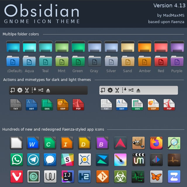
How about flat, easy to recognise icons and straight, square windows and app designs?
Brutalism for your DE!
Another thing that's needed is icon labels or alternative text. Apps like LibreOffice suffer from icon-heavy UI which is hard to understand and remember for new users and even for me without any explanations.