This should be redesigned. The dot-menu has close and bookmark options. There is more than enough to move these to the front. Dot-menu just adds more touch.
A place to discuss the news and latest developments on the open-source browser Firefox
This should be redesigned. The dot-menu has close and bookmark options. There is more than enough to move these to the front. Dot-menu just adds more touch.
Close doesn't need to be there since its on the left and bookmark should take precedent over collections, since those are literally just bookmarks too.
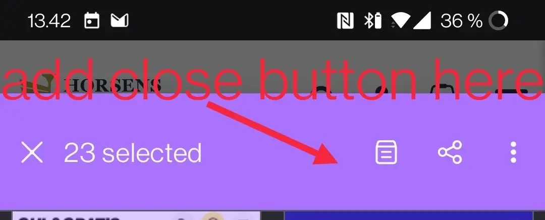
Where on the left? The X icon? Have you tried to press the X icon?
Bookmarks and collection are the spawn of the devil. Collections is not a desktop feature thus rendering sync useless. Just use bookmarks.
Sorry, the X was cancel selection not close the selected tabs.