66
Phanpy: probably the best mastodon minimal webclient
(phanpy.social)
submitted
5 months ago* (last edited 5 months ago)
by
graphito@beehaw.org
to
c/technology@beehaw.org
Readme of the project:
Minimalistic opinionated Mastodon web client.

🗣️ Pronunciation: /fænpi/ (FAN-pee) 🔊 Listen
This is an alternative web client for Mastodon.
- 🏢 Production: https://phanpy.social
productionbranch- break less often
- slower fixes unless critical
- 🏗️ Development: https://dev.phanpy.social
mainbranch- may see new cool stuff sooner
- may break more often
- may be fixed much faster too
🐘 Follow @phanpy on Mastodon for updates ✨
Everything is designed and engineered following my taste and vision. This is a personal side project for me to learn about Mastodon and experiment with new UI/UX ideas.
Features
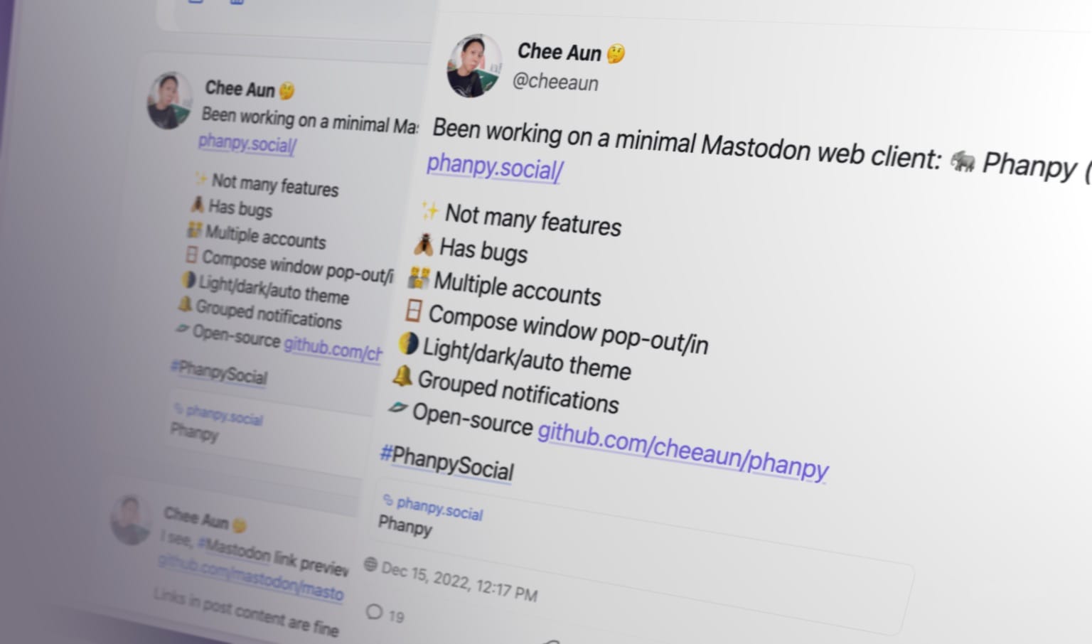
- 👪 Multiple accounts
- 🪟 Compose window pop-out/in
- 🌗 Light/dark/auto theme
- 🔔 Grouped notifications
- 🪺 Nested comments thread
- 📬 Unsent draft recovery
- 🎠 Boosts Carousel™️
- ⚡ Shortcuts™️ with view modes like multi-column or tab bar
- #️⃣ Multi-hashtag timeline
Design decisions
- Status actions (reply, boost, favourite, bookmark, etc) are hidden by default.
They only appear in individual status page. This is to reduce clutter and distraction. It may result in lower engagement, but we're not chasing numbers here. - Boost is represented with the rocket icon.
The green double arrow icon (retweet for Twitter) doesn't look right for the term "boost". Green rocket looks weird, so I use purple. - Short usernames (
@username) are displayed in timelines, instead of the full account username (@username@instance).
Despite the guideline mentioned that "Decentralization must be transparent to the user", I don't think we should shove it to the face every single time. There are also some screen-reader-related accessibility concerns with the full username, though this web app is unfortunately not accessible yet. - No autoplay for video/GIF/whatever in timeline.
The timeline is already a huge mess with lots of people, brands, news and media trying to grab your attention. Let's not make it worse. (Current exception now would be animated emojis.) - Hash-based URLs.
This web app is not meant to be a full-fledged replacement to Mastodon's existing front-end. There's no SEO, database, serverless or any long-running servers. I could be wrong one day.
Subtle UI implementations
User name display
- On the timeline, the user name is displayed as
[NAME] @[username]. - For the
@[username], always exclude the instance domain name. - If the
[NAME]looks the same as the@[username], then the@[username]is excluded as well.
Boosts Carousel
- From the fetched posts (e.g. 20 posts per fetch), if number of boosts are more than quarter of total posts or more than 3 consecutive boosts, boosts carousel UI will be triggered.
- If number of boosts are more than 3 quarters of total posts, boosts carousel UI will be slotted at the end of total posts fetched (per "page").
- Else, boosts carousel UI will be slotted in between the posts.
Thread number badge (e.g. Thread 1/X)
- Check every post for
inReplyToIdfrom cache or additional API requests, until the root post is found. - If root post is found, badge will show the index number of the post in the thread.
- Limit up to 3 API requests as the root post may be very old or the thread is super long.
- If index number couldn't be found, badge will fallback to showing
Threadwithout the number.
Hashtag stuffing collapsing
- First paragraph of post content with more than 3 hashtags will be collapsed to max 3 lines.
- Subsequent paragraphs after first paragraph with more than 3 hashtags will be collapsed to 1 line.
- Adjacent paragraphs with more than 1 hashtag after collapsed paragraphs will be collapsed to 1 line.
- If there are text around or between the hashtags, they will not be collapsed.
- Collapsed hashtags will be appended with
...at the end. - They are also slightly faded out to reduce visual noise.
- Opening the post view will reveal the hashtags uncollapsed.
Filtered posts
- "Hide completely"-filtered posts will be hidden, with no UI to reveal it.
- "Hide with a warning"-filtered posts will be partially hidden, showing the filter name and author name.
- Content can be partially revealed by hovering over the post, with tooltip showing the post text.
- Clicking it will open the Post page.
- Long-pressing or right-clicking it will "peek" the post with a bottom sheet UI.
- On boosts carousel, they are sorted to the end of the carousel.
Ooo very slick!