this post was submitted on 22 Apr 2024
331 points (98.8% liked)
Linux
48081 readers
780 users here now
From Wikipedia, the free encyclopedia
Linux is a family of open source Unix-like operating systems based on the Linux kernel, an operating system kernel first released on September 17, 1991 by Linus Torvalds. Linux is typically packaged in a Linux distribution (or distro for short).
Distributions include the Linux kernel and supporting system software and libraries, many of which are provided by the GNU Project. Many Linux distributions use the word "Linux" in their name, but the Free Software Foundation uses the name GNU/Linux to emphasize the importance of GNU software, causing some controversy.
Rules
- Posts must be relevant to operating systems running the Linux kernel. GNU/Linux or otherwise.
- No misinformation
- No NSFW content
- No hate speech, bigotry, etc
Related Communities
Community icon by Alpár-Etele Méder, licensed under CC BY 3.0
founded 5 years ago
MODERATORS
you are viewing a single comment's thread
view the rest of the comments
view the rest of the comments

What of its UX is garbage?
Genuinely curious, genuinely asking.
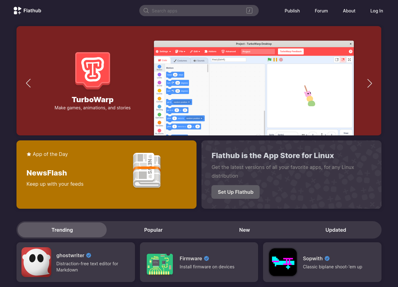
I've explained in another comment. They have these pages that seem arbitrarily made up to fulfill certain needs but not others.
You can get a list of packages sorted by popularity and with paging, but no filtering.
You can get a list of packages with filtering but it's limited to 1,000 packages for some reason, no pagination, and no sorting.
The way to find these lists is really unintuitive (go on, try to find the second one I mentioned).
There's no package count, unless you find the filter page and add up certain categories (I'm guessing they have about 2,600 packages but it's just a guess).
I have no idea why they can't just put everything I mentioned in one place. There's no reason they can't have a page with search, categories, sorting, pagination, and counts. I struggle to think why this one page can't be the homepage (with whatever defaults they think it makes most sense, like most popular packages first by default).
Having a homepage that only shows a handful of categories and a handful of apps in those categories really hurts discoverability. You'll never be able to find an app like Stellarium for example if you don't already know its name – and this applies to the vast majority of those 2,600 apps, and it will only get worse as they add more.
I'm guessing they made this design back when they had very few apps, took a lot of time to release it, and by the time they did it was already outdated.