this post was submitted on 11 Jul 2023
1 points (52.9% liked)
Lemmy
12572 readers
13 users here now
Everything about Lemmy; bugs, gripes, praises, and advocacy.
For discussion about the lemmy.ml instance, go to !meta@lemmy.ml.
founded 4 years ago
MODERATORS
you are viewing a single comment's thread
view the rest of the comments
view the rest of the comments

What about it? What additional information do you think should be there? IMO it's pretty busy already there...
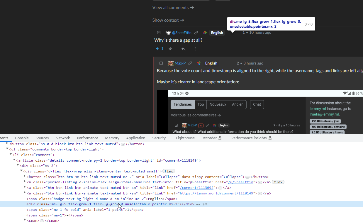
Why is there a gap at all?
Because the vote count and timestamp is aligned to the right, while the username, tags and links are left aligned.
Maybe it's clearer in landscape orientation:
No, there's an empty div.