this post was submitted on 27 Mar 2024
49 points (93.0% liked)
Sync for Lemmy
15299 readers
20 users here now
👀
Welcome to Sync for Lemmy!

Welcome to the official Sync for Lemmy community.
The rules for posting and commenting, besides the rules defined here for lemmy.world, are as follows:
Community Rules
1- No advertising or spam.
All types of advertising and spam are restricted in this community.
Community Credits
Artwork and community banner by: @MargotRobbie@lemmy.world
founded 2 years ago
MODERATORS
you are viewing a single comment's thread
view the rest of the comments
view the rest of the comments

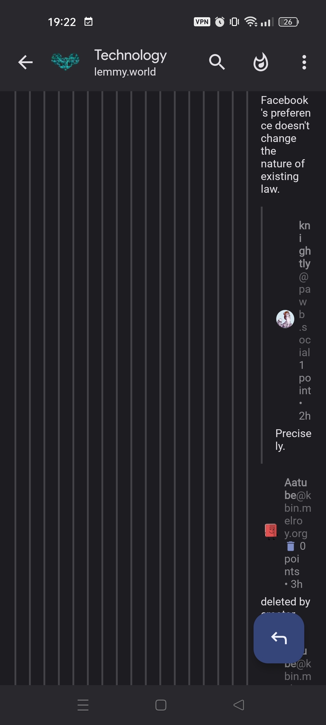
Sorry, I should have thought of that myself:
https://pawb.social/comment/7430106
Hmm, I think it looks fine for me.
What adding style are you using?
Settings shortcut: Comments > Padding style
Device information
For me it's "Material (medium padding)", I'm guessing it's similar to yours since our screenshots look decidedly similar.
sync classic all the way for me
Same here and it definitely doesn't exhibit the described behavior.
Material minimum padding, I guess that's why.
Correct. I assume that's the default.
That is unreadable to me as well on sync.
Minimum padding fixed it for me though.