Mildly Infuriating
Home to all things "Mildly Infuriating" Not infuriating, not enraging. Mildly Infuriating. All posts should reflect that.
I want my day mildly ruined, not completely ruined. Please remember to refrain from reposting old content. If you post a post from reddit it is good practice to include a link and credit the OP. I'm not about stealing content!
It's just good to get something in this website for casual viewing whilst refreshing original content is added overtime.
Rules:
1. Be Respectful
Refrain from using harmful language pertaining to a protected characteristic: e.g. race, gender, sexuality, disability or religion.
Refrain from being argumentative when responding or commenting to posts/replies. Personal attacks are not welcome here.
...
2. No Illegal Content
Content that violates the law. Any post/comment found to be in breach of common law will be removed and given to the authorities if required.
That means: -No promoting violence/threats against any individuals
-No CSA content or Revenge Porn
-No sharing private/personal information (Doxxing)
...
3. No Spam
Posting the same post, no matter the intent is against the rules.
-If you have posted content, please refrain from re-posting said content within this community.
-Do not spam posts with intent to harass, annoy, bully, advertise, scam or harm this community.
-No posting Scams/Advertisements/Phishing Links/IP Grabbers
-No Bots, Bots will be banned from the community.
...
4. No Porn/Explicit
Content
-Do not post explicit content. Lemmy.World is not the instance for NSFW content.
-Do not post Gore or Shock Content.
...
5. No Enciting Harassment,
Brigading, Doxxing or Witch Hunts
-Do not Brigade other Communities
-No calls to action against other communities/users within Lemmy or outside of Lemmy.
-No Witch Hunts against users/communities.
-No content that harasses members within or outside of the community.
...
6. NSFW should be behind NSFW tags.
-Content that is NSFW should be behind NSFW tags.
-Content that might be distressing should be kept behind NSFW tags.
...
7. Content should match the theme of this community.
-Content should be Mildly infuriating.
-At this time we permit content that is infuriating until an infuriating community is made available.
...
8. Reposting of Reddit content is permitted, try to credit the OC.
-Please consider crediting the OC when reposting content. A name of the user or a link to the original post is sufficient.
...
...
Also check out:
Partnered Communities:
Reach out to LillianVS for inclusion on the sidebar.
All communities included on the sidebar are to be made in compliance with the instance rules.
view the rest of the comments

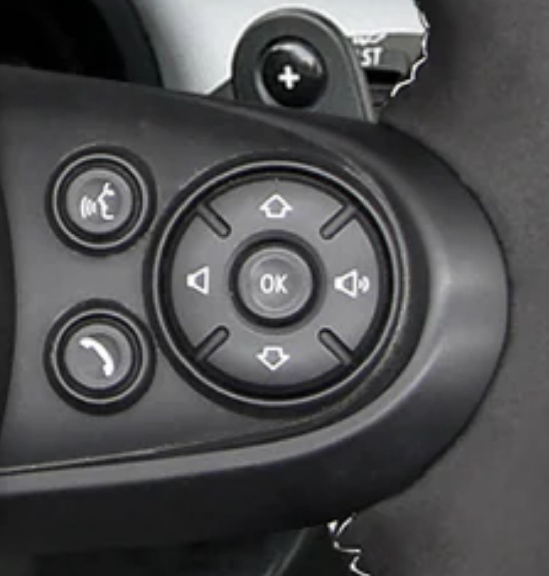
This layout makes sense if you have used an old school mp3 player or similar.
Volume is left and right because it’s an analog of the volume bar on the screen.
Up and down is previous and next because play was controlled by a list UI so you were moving a cursor up and down between songs.
It’s not how I personally would prefer it, but it’s not as outlandish as it seems.
That makes a lot of sense. I still hate it, but i understand the justification for it now.
Probably also matches to a visible screen with track visibility, so up and down is literally moving between tracks
The up and down, in this case, also correspond with how the menus work on the HUD or Center control panel. Source, MINI owner since 2009.
Thank you for making this make more sense.
I still feel like this is sillt... I've owned a lot of mp3 players and none of them worked this way. Was this a zune thing or something?
Every mp3 player I owned in the 2000’s worked this way. Screen above, controls below, list UI for tracks, usually volume rocker or dial on top.
Sometimes the UI would be more complicated and would include a left/right button for navigating horizontal menus (like my all time favorite Zen Vision:M) but the basic playlist was still a vertical scrolling list UI.