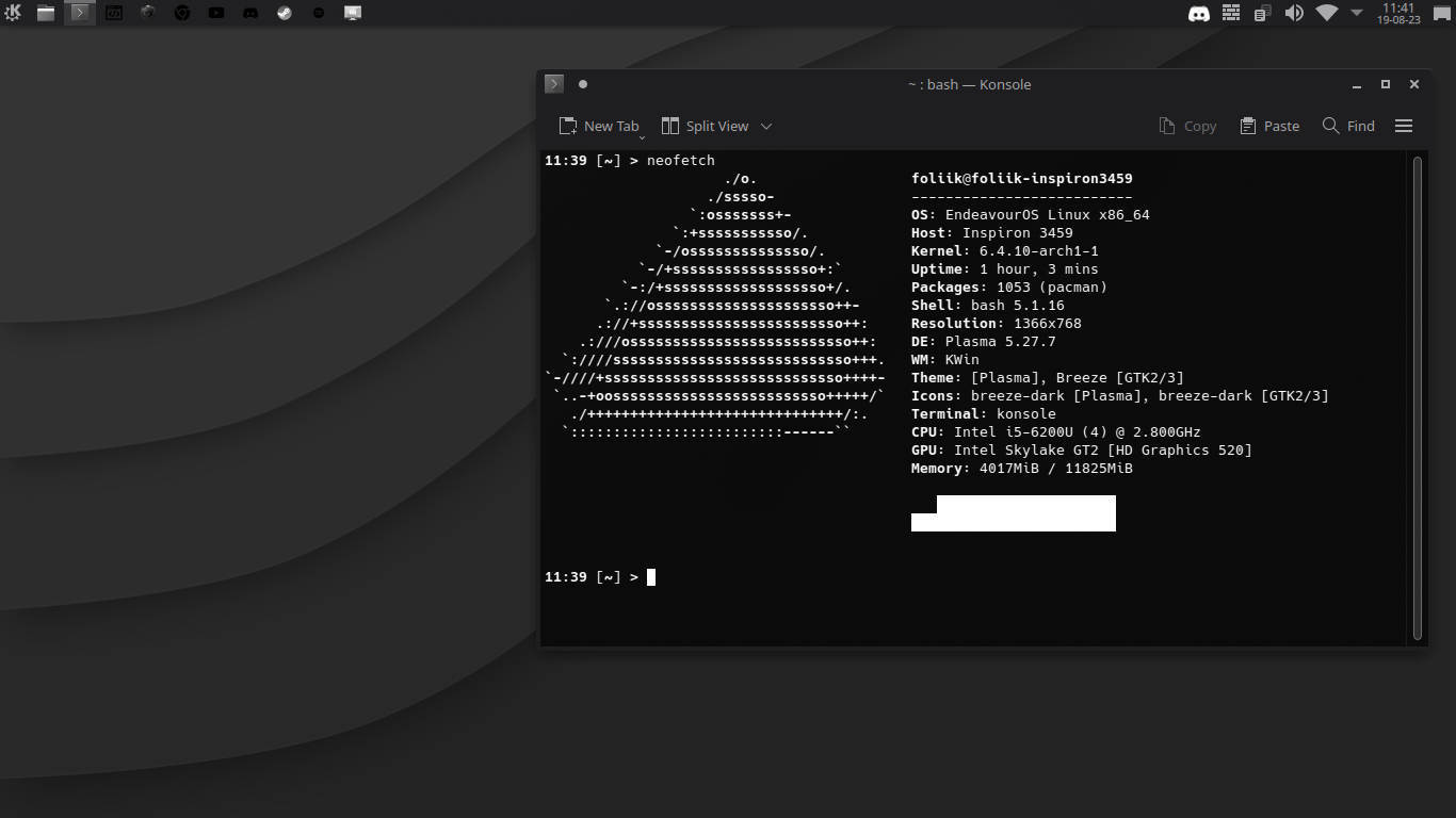
This just looks like you took a screenshot of a regular desktop and converted it to greyscale. There are a lot of things you could do to make a colourless setup work better
Unixporn
Unixporn
Submit screenshots of all your *NIX desktops, themes, and nifty configurations, or submit anything else that will make themers happy. Maybe a server running on an Amiga, or a Thinkpad signed by Bjarne Stroustrup? Show the world how pretty your computer can be!
Rules
- Post On-Topic
- No Defaults
- Busy Screenshots
- Use High-Quality Images
- Include a Details Comment
- No NSFW
- No Racism or use of racist terms
I'd love to know what I can do to improve it. I'll change the icons first, tho. It's my first time making a custom setup and any advice is welcome ;)
Icons are already a big part of it!
The core thought that you need to keep in mind is that without colour in your setup, you want your icons (as well as everything else) to be recognizable by shape. There should be a couple good icon sets out there, and judging by how late I am with my reply you've likely already found something decent.
You may also want to maximize the value that you can get out of the different shades of grey that are available to you. One step in that direction would be swapping out the wallpaper. Your current one is kind of heavy on gradients, which can get in the way of your other UI elements and takes away some range that you could utilize elsewhere. I recommend something more flat, or some suitable nature photography with the saturation turned all the way down if you're not too religious about the mono look.
For the theme, look for something that relies more on outlines than colours or gradients to distinguish UI elements. Ideally something that matches with the icons.
Also a little disclaimer that I don't rice much and am half talking out of my ass here. All the above is stuff I've seen or read about elsewhere, but haven't tried myself. Your mileage may vary, and happy ricing!
Your desktop looks sad.
did you rice it monochrome or did you edit the image? looks cool either way though
The second option wouldn't be a rice at all.
This reminds me of my box-task bar monochrome rice I had a few years back. Brings back the memories, good stuff! With that being said, as other users have pointed out, the icons do need a bit of a change, they aren't really recognisable. While I manually edited the svg files and replaced all my icons when I did mine, there might be some icon packs you can find.
Quickly found a screenshot, here's the rice from a bit back 
