It is still missing some core features so it cannot be my main app for now. But I definitely keep this one installed. Really beautiful work.
Apple
Welcome
to the largest Apple community on Lemmy. This is the place where we talk about everything Apple, from iOS to the exciting upcoming Apple Vision Pro. Feel free to join the discussion!
Rules:
- No NSFW Content
- No Hate Speech or Personal Attacks
- No Ads / Spamming
Self promotion is only allowed in the pinned monthly thread
Communities of Interest:
Apple Hardware
Apple TV
Apple Watch
iPad
iPhone
Mac
Vintage Apple
Apple Software
iOS
iPadOS
macOS
tvOS
watchOS
Shortcuts
Xcode
Community banner courtesy of u/Antsomnia.
Thank you! A new build with comment upvoting and replies is rolling out now. Inbox and settings will be completed in the coming days 😊
Holy shit dude, I was not expecting to be blown away by your super smooth app! This will give Memmy a run for its money..
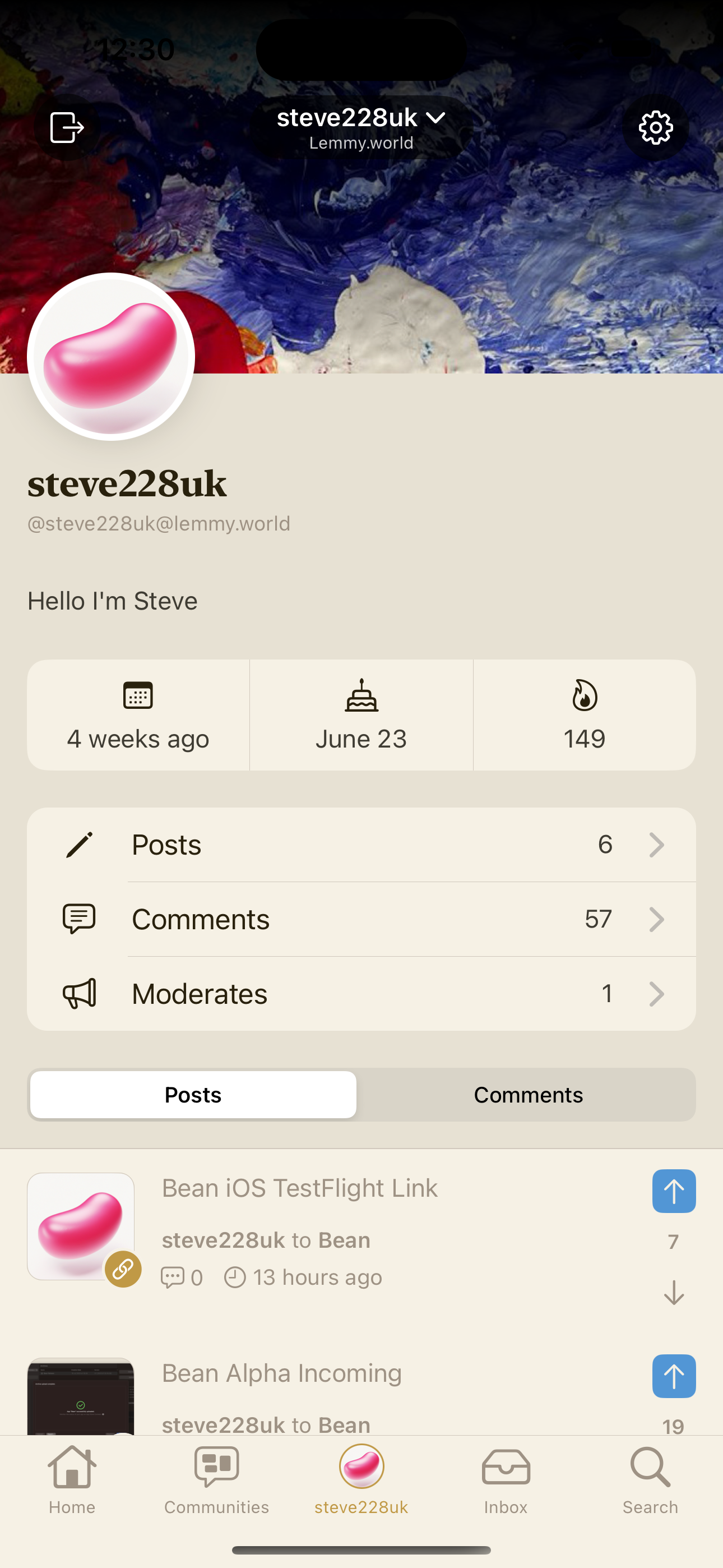
I have a few remarks, tapping on the "comments" section in my profile does not render them properly!
The themes and app icons are awesome!
While I can use the stock CC slider for font size, it would be nice to have in Bean settings, especially since fonts are in one of the logos inside settings 😄
Writing this from Bean, and from my short time with it I do like it. Bright future ahead for all the fediverse and Lemmy apps!
Trying it right now, I must say it looks gorgeous
Damn, not another Lemmy app that I have to add to my TestFlight!
Update: Very clean and smooth app. The icons are awesome. The upvoting works when scrolling through topics but not in the comment section.
Good first impression, looking forward to future updates!
Haha, hopefully Bean makes it to your home screen 😇
Installed minutes ago, already fell in love. Would be my daily driver for Lemmy now. One question: are you planning to let users edit the swipe gestures? Instead on „save“ I would like to have „hide“
It's on the list! Are there any other actions you would want to do?
Swipe for comments (reply, hide, up- downvote). But I guess you have that on the list already. [edit] pull to refresh
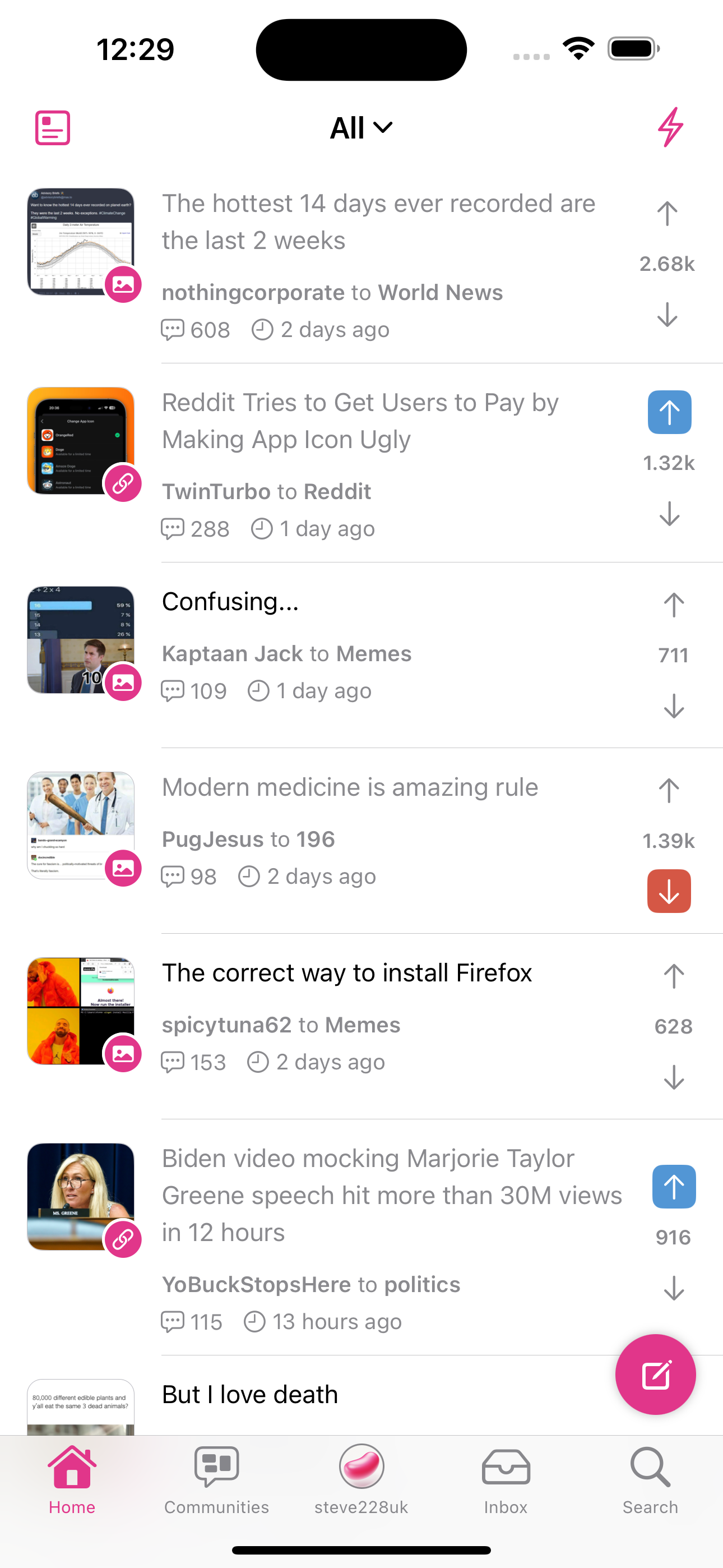
I love it! My favorite one so far. Looks very polished. My only concerns are 1) how do I get the images big like in your second screenshot and 2) please let me customize the swipes.
- It looks great, but I don't understand why there is a NSFW filter in the settings since we already have one in the account. Is it because you want to add more filters in the future? Stuff that would be impossible to do from the settings of your own account?
- Can you add a setting to remove haptic feedback? I hate this in every application.
- It's so good I would pay for your application.
Yeah, there will be a bunch more filters in there in the future such as keyword filtering. I'll see if I can pull down account settings but that's mainly there to mitigate any potential issues with App Store review.
I will add an option to remove haptics in the next build 😄
Thanks. I’m amazed that we got Lemmy applications equivalent to Apollo in such a short amount of time. Congrats.
I’ve been using it for a couple of days now. Very nice so far
Keep up the great work.
I’m not on top of all the apps, but this looks like the sort of cleanliness I’d be into. Very nice interface.
Also, as I’m sure you know, great icon.
Thank you 😄
I really like the design. Can’t wait to see it with more features working!
Thank you! More stuff rolling out now like comment upvoting and replies 😊
It looks really nice! Do you have a community? Where can submit bugs?
I do! It's over at !bean@lemmy.world
Bean is so smooth and clean! Well done!
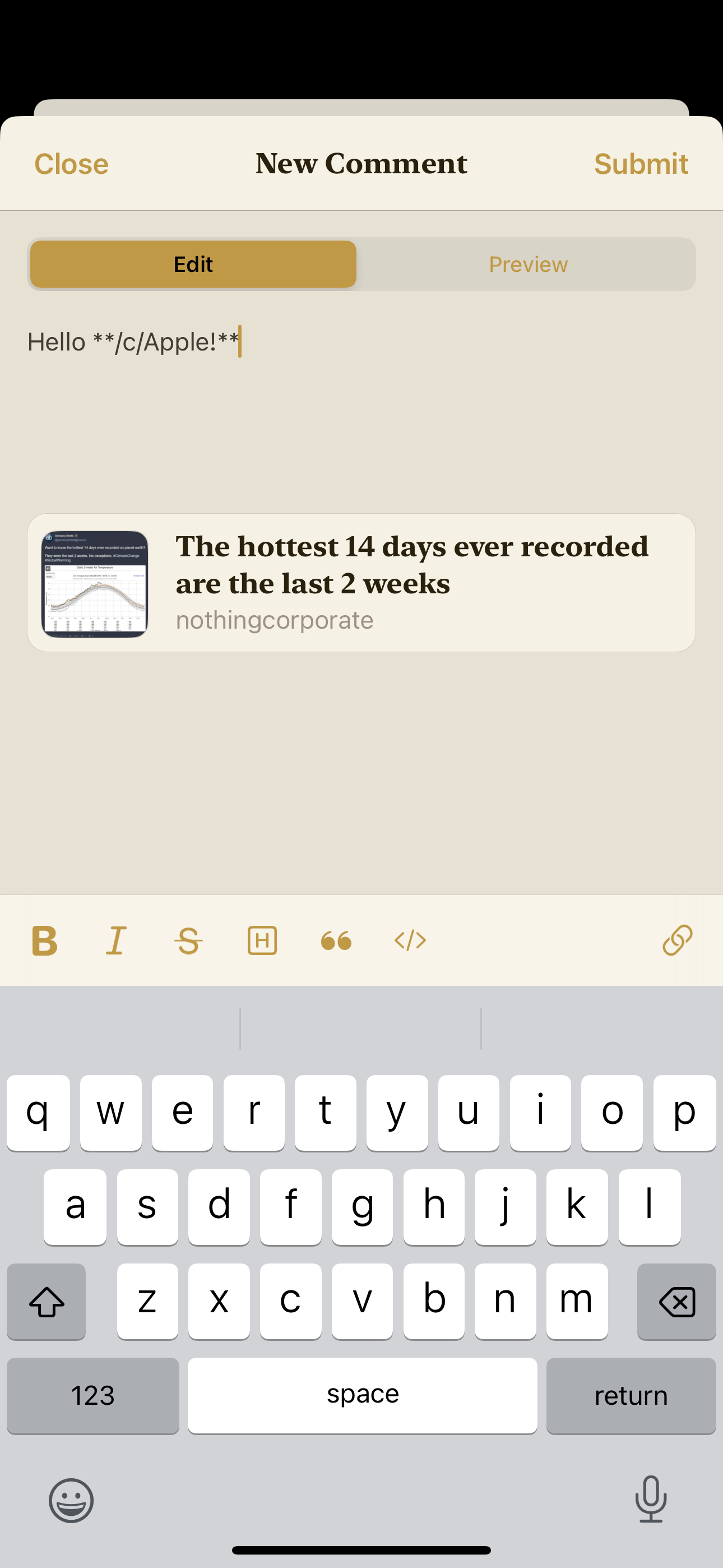
My first 2 pieces of feedback are things I’m sure you already know - I couldn’t reply to this comment in bean, and when I click your community link it opens an in-app browser rather than taking me to your community.
Oh thanks for the heads up! I'll see what's happening there. And yes, commenting is being worked on right now 😄
Beautiful app! I will definitely be keeping an eye out for future iterations. Looking forward to you implementing the ability to collapse comments, vote on comments, etc.
Downloaded it through TestFlight however when trying to login, the app crashes.
I love the placement of the upvote/downvote buttons on the posts in All / Subscribed / Local. Any possibility of having a similar design for individual comments as well?
It would be very convenient for my single hand usage of the app versus having to reach all the way to the left to upvote 😊.


