96
Which Countries Are Meeting Their Paris Agreement Goals?
(cdn.statcdn.com)
Discussion of climate, how it is changing, activism around that, the politics, and the energy systems change we need in order to stabilize things.
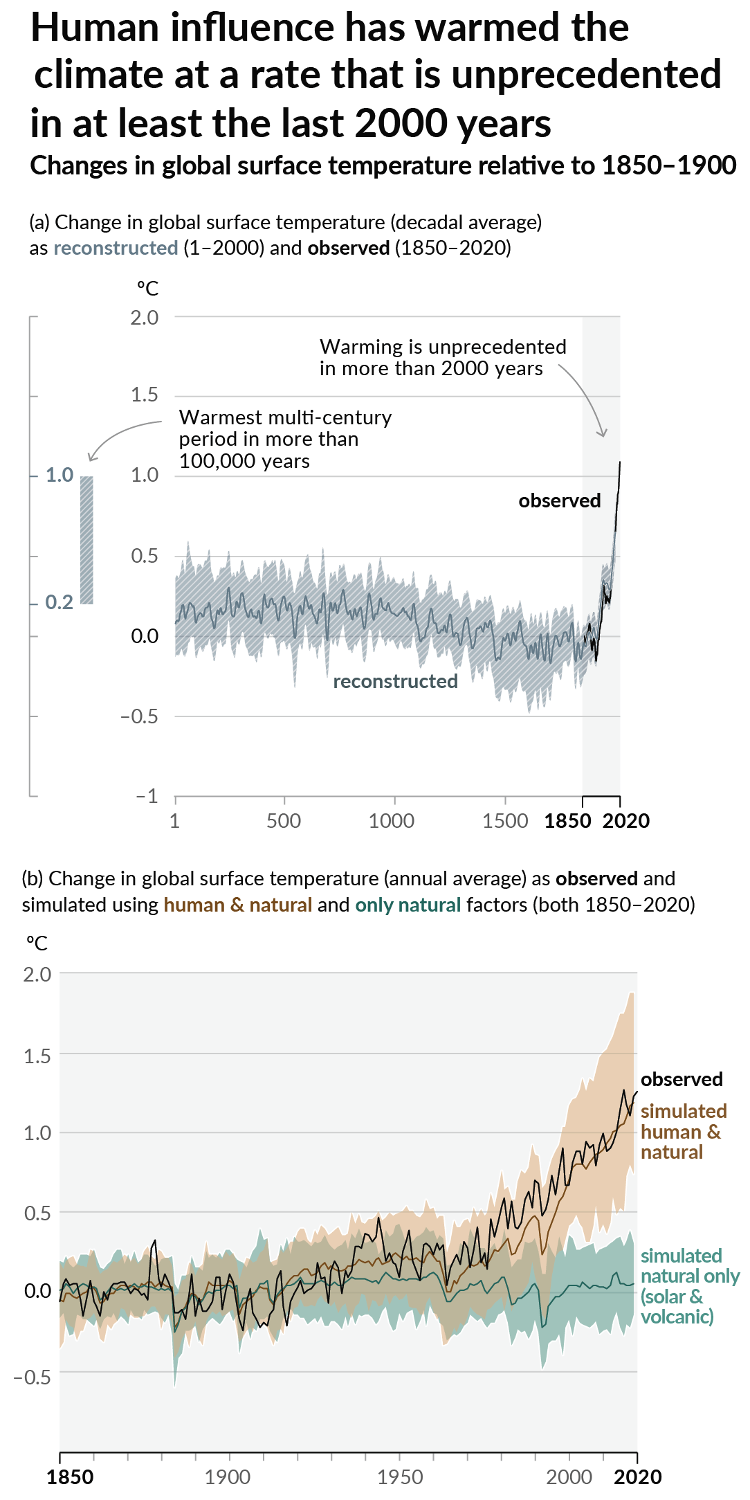
As a starting point, the burning of fossil fuels, and to a lesser extent deforestation and release of methane are responsible for the warming in recent decades:

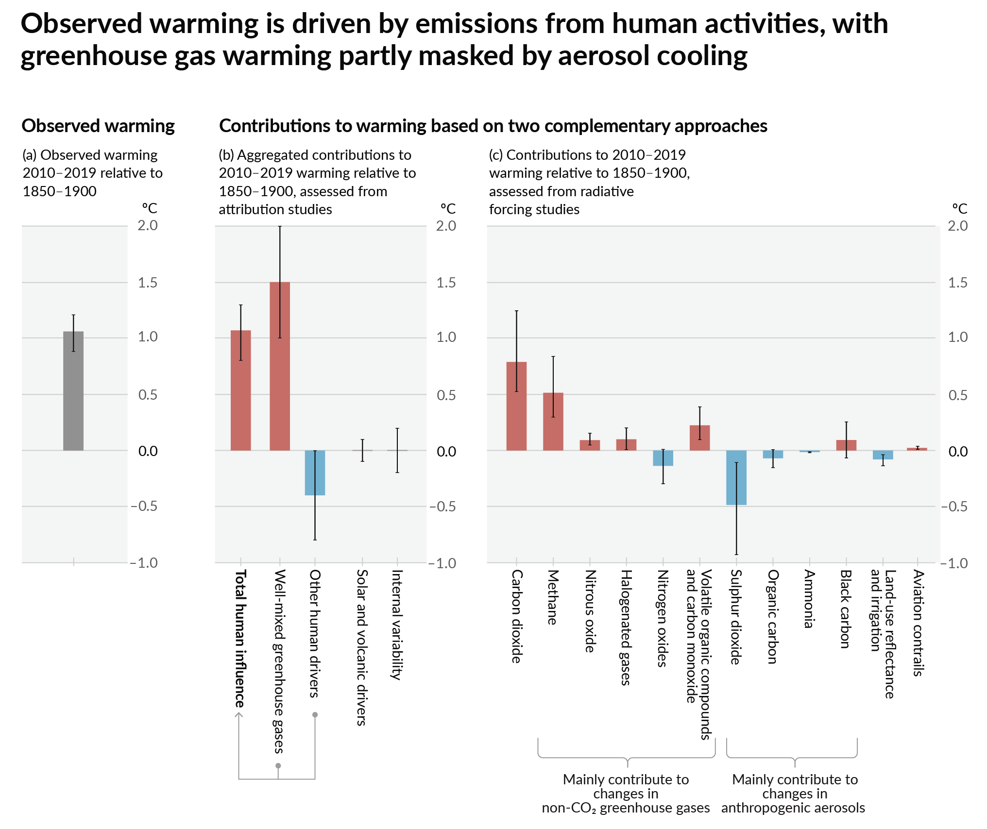
How much each change to the atmosphere has warmed the world:

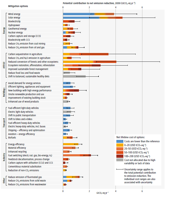
Recommended actions to cut greenhouse gas emissions in the near future:

Anti-science, inactivism, and unsupported conspiracy theories are not ok here.
The colors here are confusing because the color scale grades the temp gain, but that isn't the information that is claimed to be shown, which is whether or not they are meeting their goals.
I disagree because it portrays whether they are meeting their goals and a lot more information.
Compare the two columns and if they are the same color, they are meeting their goals.
Compare two countries to see which sets stricter goals compared to each other, or is achieving better results compared to each other.
You're right. However, I feel like the left and right columns could've been linked with a gradient to more clearly show their relationship.
I always struggle with colors because I'm colorblind, and grokking this chart at a glance is hard.